
The Frustration of the “Ghost Town” Sales Page
You have spent weeks, perhaps months, meticulously building your Online Course.
You’ve refined the curriculum, polished the video lessons, and designed the perfect student journey.
You finally hit “publish” on your sales page, expecting a flurry of notifications.
Instead, you hear crickets.
Your analytics show that visitors are arriving, but your conversion rates are hovering near zero.
This “ghost town” effect is the most common frustration among course creators today.
The reality is that your sales page is not a passive brochure; it is a high-stakes psychological machine where your brand message meets a cold, skeptical prospect.
If your visitors aren’t buying, it isn’t necessarily because your digital products are poor; it is because the bridge between interest and action has collapsed.
This article will help you audit your landing page, diagnose the technical bottlenecks, and refine your copy to turn stagnant traffic into loyal students.
Why high traffic doesn’t always equal high sales
Many course creators mistake traffic for potential, believing that if they just push more visitors to their site, the math will eventually work out.
This is a dangerous fallacy.
Traffic is a vanity metric; conversion rate is a business metric.
If your offer or messaging is misaligned, doubling your traffic via Social Media or paid ads will only result in double the disappointment.
High traffic with a low conversion rate usually indicates a fundamental disconnect between your marketing promise and the reality of your page.
Shifting from “Selling a Product” to “Solving a Problem”
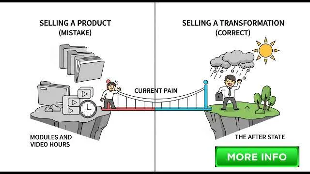
Your sales page should clearly illustrate the bridge between your prospect’s current pain and their desired future.
Most creators sell information, focusing on module counts and video hours.
This is a mistake! Nobody buys a course because they want to watch more videos; they buy because they want to escape a painful situation.
To improve your conversion rates, you must stop selling a product and start selling a transformation.
Your sales page should articulate the “after” state—how the customer’s life changes once they complete your program.
Why vague headlines kill conversion rates
The headline is your most critical asset.
If it is clever or abstract, you have already lost.
Visitors have an incredibly short attention span, often deciding within seconds whether to stay or bounce.
A vague headline forces the user to work for the answer.
If they have to scroll to figure out what you are offering, they will simply click the back button, spiking your bounce rate.
The 5-second rule: Can visitors tell what you offer immediately?
Apply the five-second test: Ask a stranger to look at your site for five seconds and then describe what you are selling.
If they cannot identify the benefit and the target audience immediately, your headline is failing.
Your message must be instant, direct, and benefit-driven to keep leads engaged.
How to Fix It: Crafting a value proposition that speaks to the student’s end goal
Rewrite your headline using a proven formula: “How to [Desired Result] without [Pain Point] in [Timeframe].
” For instance, instead of “Mastering the Art of Digital Marketing,” try “Learn the exact strategy to land your first 10 paying clients in 30 days without spending a dime on ads.
“
The “So What?” test for your course content
When describing your curriculum, ask “So what?” after every point.
If you say, “This course includes 10 hours of video,” ask “So what?” The answer isn’t “because there is more content,” but “so you can save time and stop guessing.
” If you cannot find a transformation for a feature, remove it.
Features vs.
Emotional Benefits: Moving beyond the curriculum
Features explain what the product is; emotional benefits explain how it changes the user.
The student doesn’t care about your PDF checklists; they care about feeling confident and reducing stress.
Your copywriting principles should focus on these emotional drivers to build desire.
How to Fix It: Using the PAS (Problem-Agitate-Solution) framework to rewrite your copy
The PAS framework is the gold standard for sales page copy.
First, identify the Problem the reader faces.
Second, Agitate it by describing why that problem is painful.
Finally, present your course as the Solution.
This creates a connection that a simple list of features never will.
Why generic testimonials are no longer enough
“This course was great!” doesn’t help you sell.
Modern buyers are skeptical.
They look for specificity.
A powerful testimonial mentions the struggle before the course and the specific, measurable result after the course.
The “Invisible Wall” of buyer skepticism
Every visitor enters your site with an “invisible wall” of skepticism.
Generic social proof doesn’t penetrate this because it feels fabricated.
You need objective case studies to prove your process works, which in turn builds the credibility required to close the sale.
How to Fix It: Building high-impact case studies and incorporating “Trust Signals”
Replace generic quotes with mini-case studies.
Include a photo, their title, and their specific metric of success.
Incorporate trust signals like “As Seen In” logos or security icons near the purchase button to reassure the user that your site is a safe, professional place to conduct business.
Strategic placement: Where to put social proof for maximum impact
Don’t hide your testimonials on a separate page.
Place them directly beneath your primary call to action or adjacent to the most difficult-to-believe claims.
Proximity is key; when you make a promise, the proof should be right there.
How slow load times and “Tech Overwhelm” lead to high bounce rates
A page that takes more than three seconds to load is a conversion killer.
If your load times are sluggish due to a bloated tech stack, your bounce rate will climb.
According to Google, even a one-second delay can significantly impact mobile engagement.
The reality of the “Mobile-First” buyer journey
Audit your page on your smartphone.
Are the buttons clickable? Is the text legible? If your Mobile Experience is an afterthought, you are losing a massive portion of your audience.
Ensure your design is responsive and keeps the User Experience fluid on smaller screens.
How to Fix It: Optimizing your tech stack for speed and accessibility
Whether you use a specialized course platform like Circle, Mighty Networks, or a WordPress-based setup, ensure you are using compressed images and clean code.
Remove excessive plugins that add friction.
A fast, simple page almost always out-converts a complex, feature-heavy design.
Streamlining the checkout process to prevent abandoned carts
Every extra field in your checkout form is a potential point of failure.
Ask for only the bare minimum.
If you don’t need their phone number to process the sale, remove the contact form field.
Implement an abandoned cart email sequence to capture those who leave at the last second.
The “Paradox of Choice”: Why too many options stop the sale
If you offer three different tiers, a newsletter sign-up, and a free webinar all on the same page, you are paralyzing the reader.
The “Paradox of Choice” states that more options lead to less action.
For a sales page, focus on one primary path to purchase.
Passive vs.
Active Language: Why “Submit” doesn’t work
“Submit” is a boring, passive command.
Use active, value-oriented language on your buttons.
Try “Get Instant Access” or “Start My Transformation Now.
” These buttons reinforce the benefit of the click and drive better micro conversions.
How to Fix It: Designing “High-Intent” calls-to-action using the AIDA model
Structure your page to build Attention, create Interest, foster Desire, and then trigger Action.
By the time they reach your call to action, they should feel like clicking is the natural next step.
Use A/B tests and split testing to see which button colors and phrases drive the most clicks.
The power of a single, focused path to purchase
Remove all unnecessary navigation menus during a launch.
You don’t want them wandering off to your blog.
Keep them in your sales funnel until they either convert or leave.
Use tools like Google Analytics and Google Search Console to identify exactly where users are dropping off.
Sticker shock and the psychology of perceived value
If your price appears in a vacuum, it feels expensive.
Use price anchoring to set expectations by listing the total value of what the student receives before the actual price.
Offering automated payment plans can also help reduce the barrier to entry, making the cost feel more manageable.
Why your “Guarantee” might be hurting your credibility
While a money-back guarantee is standard, phrasing matters.
If you sound desperate—e.
g.
, “Please try it, there’s no risk!”—you diminish your authority.
A strong, professional “14-day no-questions-asked refund policy” is a trust signal that shows confidence in your digital products.
Conclusion
Converting visitors into customers is not a matter of luck; it is a matter of strategic communication and psychological alignment.
By auditing your sales page against these seven mistakes, you can transition from a “ghost town” to a high-converting machine.
Start by fixing your headline to ensure it offers immediate value.
Strip away the list of features in favor of emotional transformations, bolster your authority with specific case studies, and ensure your technical ecosystem is optimized for speed.
Finally, use content marketing and your email list to nurture prospects before they even reach your page.
Remember, a sales page is never “finished”—it is an asset that undergoes constant optimization through data-driven split testing and continuous refinement of the customer journey.
Start testing today, and watch your conversion rates climb.
